

The fastest way to up-level your business’ image and stand out from the small business crowd is to create a visual brand that’s consistent, polished and coherent in all of your marketing materials (onscreen and offscreen.) Great branding makes you look professional and can turn a casual browser into a potential customer.
I understand of course, that lots of us business owners don’t consider ourselves particularly artsy … and even if we do, we likely still have questions about choosing the best fonts and colors to represent the service we provide.
I hired a branding strategist when I started my first company over 10 years ago. I took what I learned from that experience, some insight from my Silicon Valley startup friends and all the free content on Google to create my own branding style guide.
Your brand style guide is the battle plan for the visuals on your website and marketing materials.
Let’s a take a look at what’s inside:
- Color Palette
- Fonts
- Logo
- Messaging
This post is all about the first two things: color palette and fonts.
Creating a color palette that works for your business:
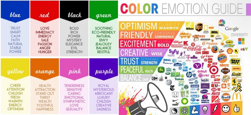
Color plays an important role in how your brand is perceived. When choosing your palette, think about the feeling, emotions and personality you want your brand to portray (instead of just using your favorite colors.)
You can Google “color psychology” (the study of colors in relation to human behavior) to learn about the meaning of colors.
Here’s a quick overview from some of the well-known brands:
Include 3 to 4 colors for your color palette. This should include a color for your font, call-to-action buttons and accent colors.
Here are some resources that I’ve used to create my color palettes:
Canva
Canva is graphic-design tool website for non-designers that makes it easy to create beautiful, professional designs and documents. You can use their color palette generator by uploading a photo or get more inspiration from these 100 brilliant color combinations they put together.
Design Seeds
This site is powered by its patrons and pairs beautiful photography with color palettes that you can’t help but feel inspired by. I honestly can scroll through Design Seeds hours on end! You can explore by color or collection.
ColorPick Eyedropper
I also use the Google Chrome Extension, ColorPick Eyedropper tool, that allows you to find out the color values from product and design inspiration while shopping online.
Coolors
You can take those color values and plug them into Coolors, an online color scheme generator, which generates colors that work together. Your downloaded color combination comes with the Hex and RGB color code to use on screen and the CMYK to use for print. You need these codes for your Canva designs, web development or if you’re working with a graphic designer.
Dear Jenny: The Color Story
I most recently used the ColorPick Eyedropper tool, ColorHexa and Coolors to create the Dear Jenny color palette.
Being an entrepreneur can be stressful. My goal in choosing this palette was to give you a feeling of calm and serenity. I want you to take a break from the work and social media noise and sit back with a cup of coffee (or glass of wine!) while soaking in inspirational content and finding the answers to your questions.
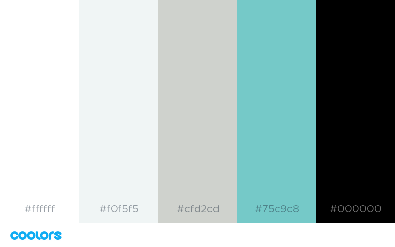
I went with a coastal palette because I wanted to keep the site clean and crisp. I planned to use the accent color sparingly since the site will have an array of colorful images in the Q+A column and blog. Strategic use of bolder colors creates a better user experience by not distracting from the content.
Choosing fonts that work together:
You likely just need two fonts: something clean for the majority of text on your marketing materials and then something with more personality to use as an accent that’s associated with your brand.
Choosing fonts that fit the tone of your messaging can be tricky. One thing that helps (with choosing a more interesting accent font in particular) is to consider your customer and service. How formal or casual is what you do? How serious or playful? Do you want something feminine? Modern-looking?
Read Canva’s Ultimate Guide to Font Pairing. It’s an easy and visual read to help you learn more about typography and use as a reference.
You can source fonts from Creative Market, Adobe Type Kit (what I’m using now), Google Fonts, and MyFonts to use in your digital assets and web. There are many resources, but these have always been my go-to.
If you want to stick with Google Fonts, TypeWolf just released a blog post called, A Curated Collection of the 40 Best Google Fonts that’ll be a helpful read for you.
A Few Font-Picking Tips to Keep in Mind:
- Whenever you purchase fonts, be sure you read the use licenses for print and web. A font may be okay on your website, but not on product packaging, for example.
- Also, discuss your font choices with your web developer to make sure the fonts you chose won’t slow your site down.
- Know that certain fonts (more decorative accent fonts in particular) might not be supported on all devices. That means visitors to your site may see a generic font in its place. One way to get around this is to use photo images of headings in your decorative font, rather than typing those headings as text, because the photo will show no matter what device the visitor is using.
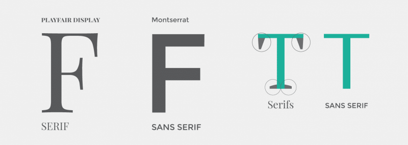
For Dear Jenny’s fonts, I was inspired by the beautiful serif fonts used on many popular blogs, especially health and beauty related ones. Here’s a little graphic that shows the difference between serif and sans serif fonts, via Easil:
I find serif fonts to be feminine and professional and this is my first time choosing one for a business. After spending hours (I know!) perusing fonts, I chose Calluna and its san serif counterpart Calluna Sans because I wanted to keep the feel of DearJenny.co simple and refined. I use a blend of light, regular, semi-bold and bold throughout the website for headings and body font.
In the next upcoming articles, we’ll dive into creating a logo, messaging and putting your style book together.
Here’s the Recap:
- Do a quick study of color psychology to help pick a palate that’ll underscore how you want your customer to feel when they think about your business.
- Once you’ve got an idea of colors that’ll work, use one of the online tools mentioned in this article to see how your colors will look together on your marketing and branded materials.
- Your fonts convey the personality of your business. You’ll need one with more personality for your headings and maybe logo (i.e. text you want to really stand out) and a second, cleaner, super readable font for the rest of the text in your marketing and branded materials. Read Canva’s Ultimate Guide to Font Pairing for some helpful tips!
Have questions? Want video tutorials? Drop your comments below….


+ Show Comments
- Hide Comments
Add a Comment